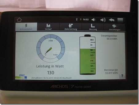
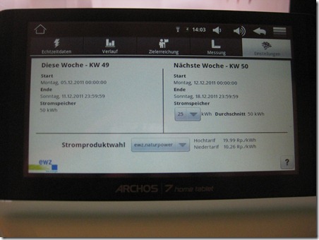
The first tab is composed of an indication of the current electricity consumption and a summary of how much power has been used this week. We’ll see in the last part where the number of 50.0 kWh comes from.
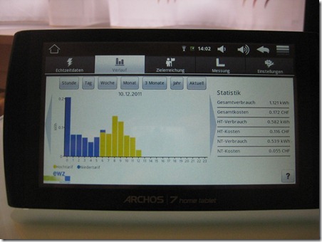
The second tab gives an insight into the historical data collected by the smart meter. According to the information given in the documentation, the smart meter is able to collect up to a month of data before it gets overwritten. A part of the role of the tablet is to store for the full duration of the study these records.
Going back to this tab, the graph can be setup per hour, day, week, month, three month or year. It also gives an insight into the power costs for the given period.
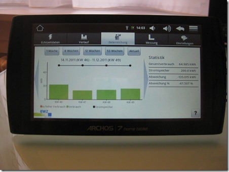
The third tab gives an overview of the power usage versus a target consumption. We’ll see later that we can set ourselves the target for the upcoming week.
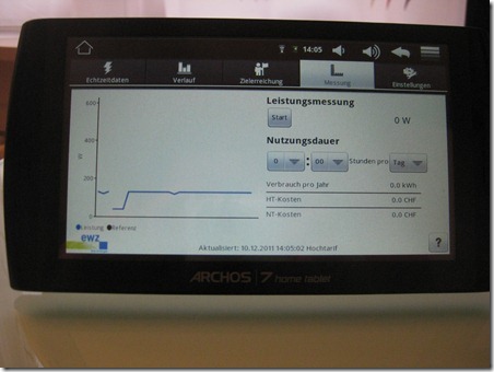
The forth tab gives the ability to track ever update from the smart meter. It is also possible to press the start button to record the variation and calculate the overall expenture.
Finally, the last tab is about configuration and shows a summary of this week and allows to set a new target for the upcoming week. In our case, we decided to lower the target from 50 kWh to 25 kWh next week.
This will affect from next Monday on the weekly summary displayed on the first screen.

